Evolving the brand and design language for casino group.
We were appointed by Aspers Casino to run a brand positioning workshop to help this successful casino group realign and differentiate their brand offer.
This led to a process of brand refinement and visual language shaping, including evolving their existing logo.
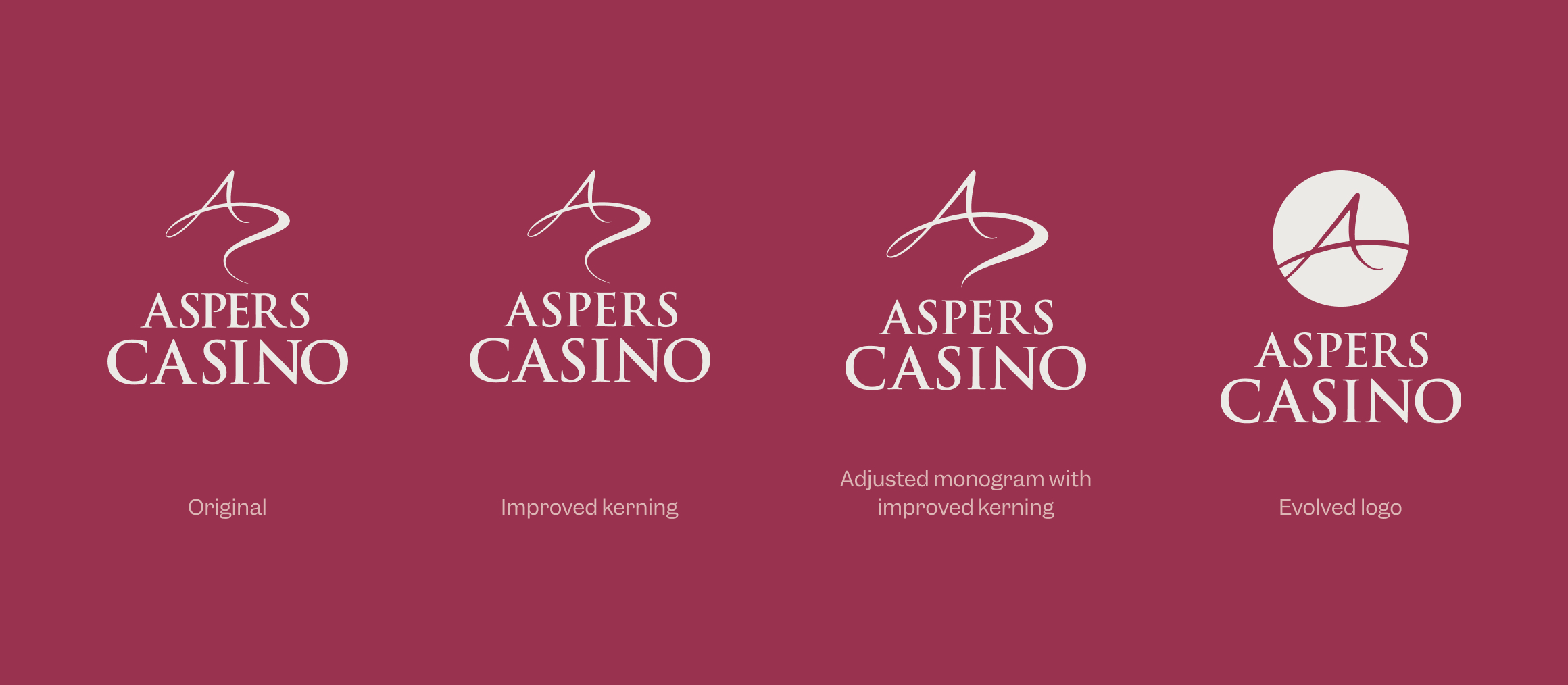
The logo composite image below, illustrates the design evolution that we gently guided the client towards – from their current logo (far left) to the accepted finessed logo (far right and above).
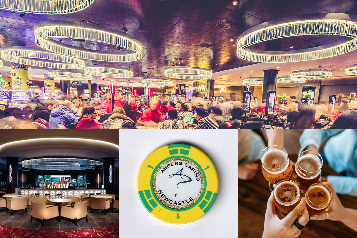
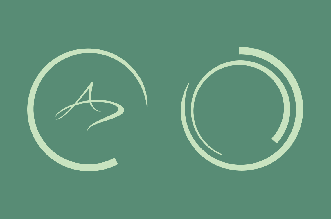
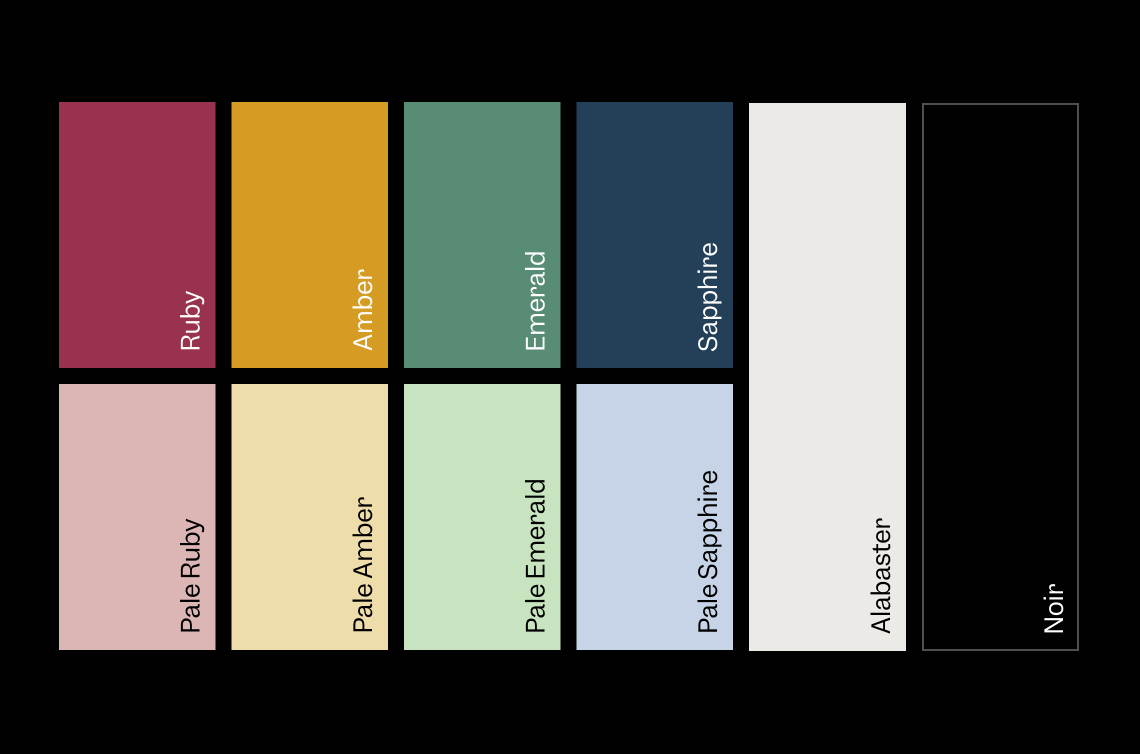
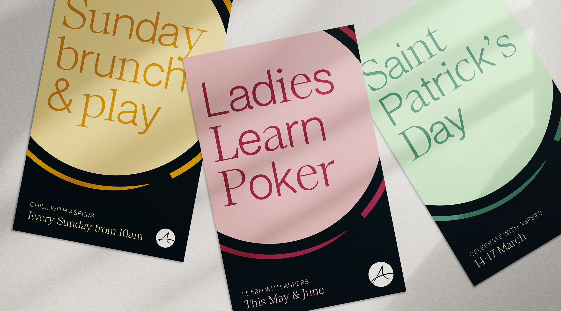
The circle introduced into the new branding takes its cue from physical circular elements that we identified in and around the casino venues in Stratford, London and Milton Keynes. This then informed the design style for brand templates, promotions and print and digital communications throughout the venues. We introduced a new brand typeface and colour palette to create a distinctive ‘Asperational’ (playing on the brand name) design language.
We delivered:
Brand identity, Tone of voice, Design systems, Printed comms, Digital comms, Ongoing design support
We say:
As an outcome of the highly effective immersion workshop process that we ran with our client, we developed a brand proposition of ‘Asperational Moments’. Building on the idea of the unexpected, wow experiences that guests encounter at Aspers Casino, the language of ‘CasinOOOH!’ was born.
Client says:
It’s not easy to find an agency who really listen to your brief and work collaboratively to make sure they deliver what you’re trying to achieve, but CC do just that. They consistently deliver highly creative solutions coupled with exceptional account management, ensuring continual communication on timings and deliverables. They are a joy to work with!